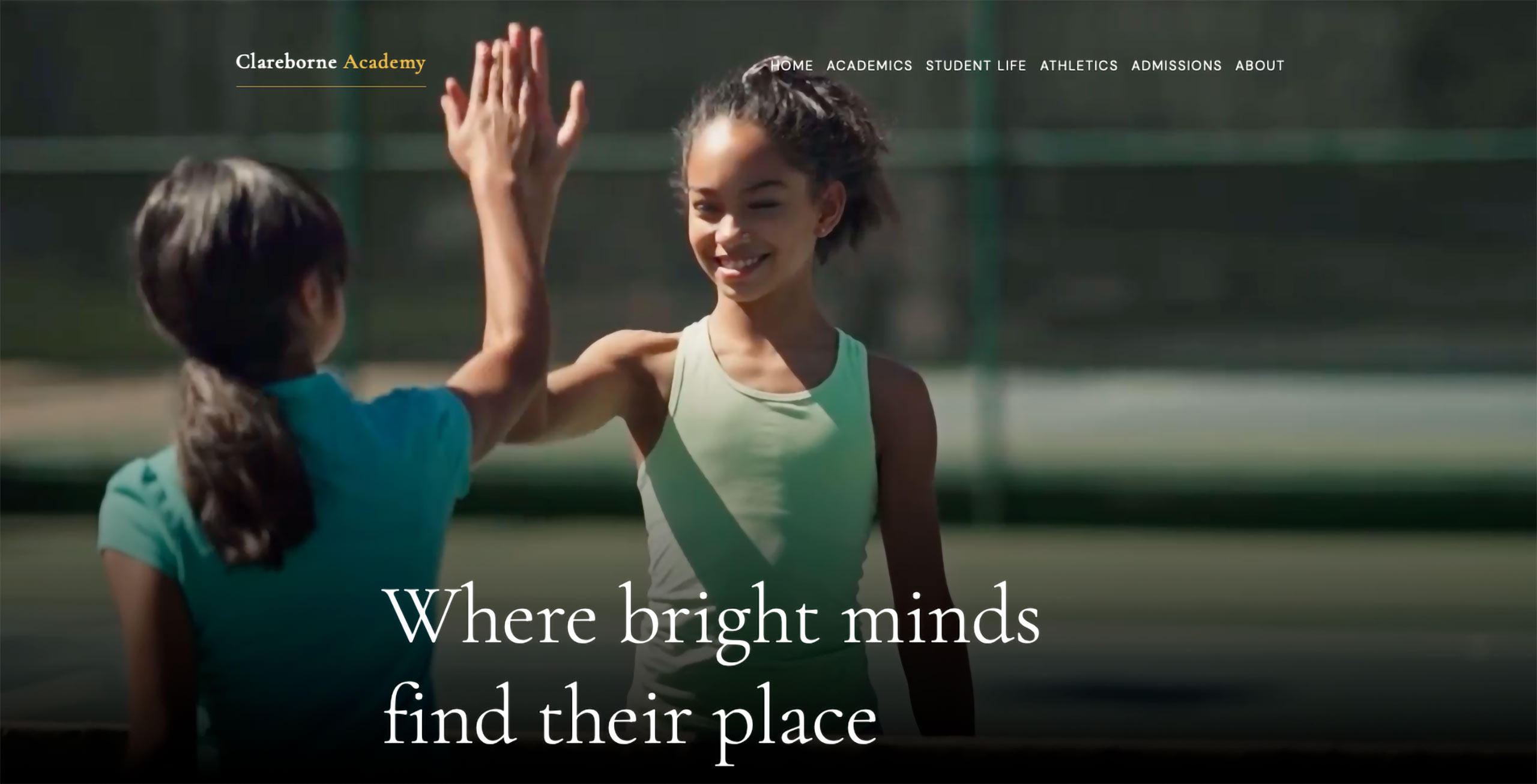
If you were to drive down the Third Beach Road in Middletown, you’d pass the Norman Bird Sanctuary and perhaps a few tourists on horseback before making your way down to the beach.
But you wouldn’t find a school named Clarebourne Academy — because we made it up.
A fictional school with a real content strategy — this site is our working demonstration of what mission-driven communications look like when the platform, design, and the content work together.
The communications brief
Independent schools experience similar communications challenges — the market for private education is highly competitive. Schools need to establish trust and build relationships, from the prospective stage to alumni. School websites are often designed to impress, but don’t always inform their audiences. Important information is often buried and the school’s spirit — that authentic thing that would make a family choose it over the other schools they’re considering — doesn’t come through.
We wanted to build a demonstration site structured around the information families want to find on a school website.
We envisioned a K–12 independent school of 720 students, positioned in a competitive suburban market against two well-established and highly prestigious neighbors. Schools that gain momentum often do so by leaning into their mission and values, so we decided Clarebourne should do the same. The strategy: position Clarebourne itself as an affordable and diverse alternative through a commitment to a consistent whole-child approach to learning and radical informational transparency.
Before we made decisions about look and feel, we mapped the prospective family’s decision process as it unfolds: awareness, consideration, evaluation, application, and confidence. Clarebourne was designed to serve visitors at every stage and help them find opportunities to connect.
A clear structure
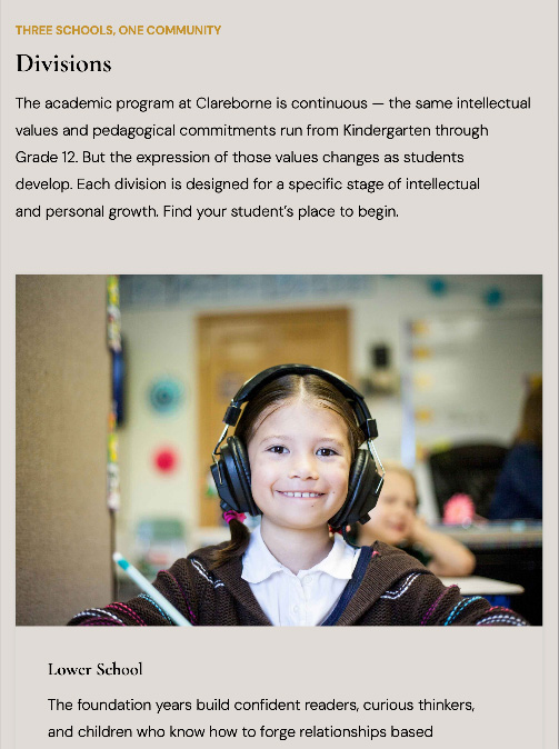
The communications brief for Clarebourne Academy called for a simple, six-section information architecture with some deliberate departures from convention. School websites often have complex structures because communicators are tempted to place everything important in the main navigation. Our approach: provide users with a few clear choices and empower them to explore themselves. Admissions was designed as a conversion section with a single call to action on every page: visit, apply, or talk to us.
The homepage tells the whole story in sequence: who we are, why it matters, here’s exactly what it costs, and here’s your next step. Tuition figures and financial aid percentages appear prominently. The admissions and financial aid processes are broken down explained clearly.
Aligning the web communications strategy with the school values and mission produces better content. Information transparency is not only defined as a value, but informs the brand position and design. It almost makes a fake school seem real.
Brand identity
The palette is built on Clareborne Black, a warm slate family, and a single amber accent that does all the decorative work. Two typefaces: Cormorant Garamond for all display and headline work — a refined revival of 16th-century type that signals tradition and intellect without effort — and DM Sans for all functional UI, body copy and navigation.
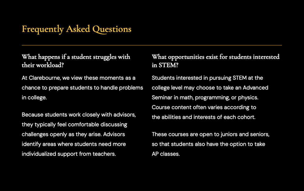
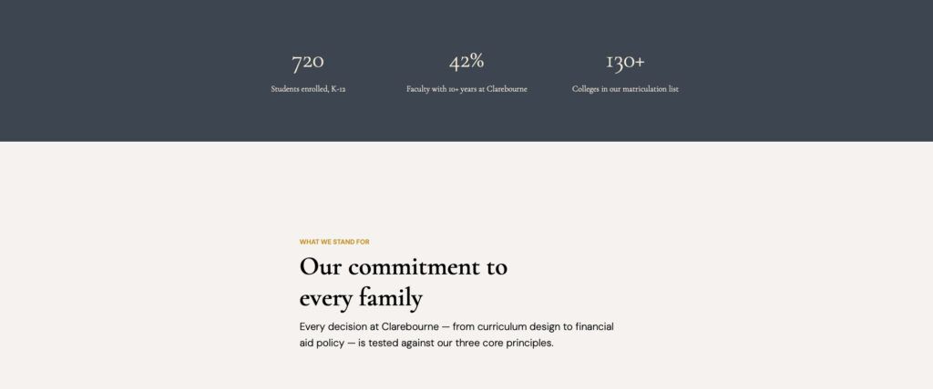
The competitive positioning is explicit in the copy. Clarebourne isn’t the oldest school in the area, or the most selective. It acknowledges its peer institutions are excellent, trusting families and students to determine the best fit for them. The brand voice that runs consistently through every page is sharp, confident, and warm.
Platform
Clarebourne Academy’s website runs on WordPress customized by Così Digital — which means it’s fast, accessible, and easy to edit.
The design system uses CSS custom properties, fluid typography, and an architecture that gives a communications team true flexibility without editing code. Spacing, padding, abutment, and typographic pairing are all handled through a documented system that works predictably across the site.
Calendar — every school event is searchable and filterable, rendering correctly on mobile without a separate app or third-party embed. Parents can find what they need in seconds or subscribe on their phones.
Virtual tour — the campus map module lets prospective families explore the school before they visit. For a school whose admissions pitch includes shadow days and in-person visits, reducing friction to that first contact is directly valuable.
Athletics — teams, players, and game schedules managed from a single backend interface. For a school whose athletics program is part of its whole-child approach, this feature is essential.
People — faculty directory management that makes it easy to keep bios, headshots, and department listings current. Faculty tenure is a trust signal at Clarebourne; the website needs to make it visible.
What it demonstrates
The Clarebourne Academy website serves as a working prototype of what we offer schools: a full-service strategic communications partnership. We help institutions articulate what makes them worth choosing, build the content structure that communicates it clearly, and deploy it on a platform that performs, scales, and lends itself to easy maintenance.
The site was built efficiently, using a disciplined process that moves from strategy to identity to content to build:
- Every decision connects to the brief
- The typography, layout, and messaging reinforce the brand voice
- The information architecture serves the prospective family journey
- The platform serves the communications team
If your school would benefit from a website that aligns seamlessly with its mission and goals, we’d like to talk.